The Best and Worst Rebrands of a Sports Franchise
![]() by Richard Janvrin,
September 04, 2025
by Richard Janvrin,
September 04, 2025
Throughout sports history, there have been numerous sports rebrands that have piqued fan interest or left them shaking their heads, wondering, “Why?”
Below, we’ll examine the best sports rebrands and the worst sports rebrands and explain why the decisions either met the mark or fell short.
Let’s dive in.
- Best Sports Rebrands: Tampa Bay Rays
- Worst Sports Rebrands: Washington Commanders
- Best Sports Rebrands: Chicago White Sox
- Worst Sports Rebrands: Cleveland Browns
- Best Sports Rebrands: Charlotte Hornets
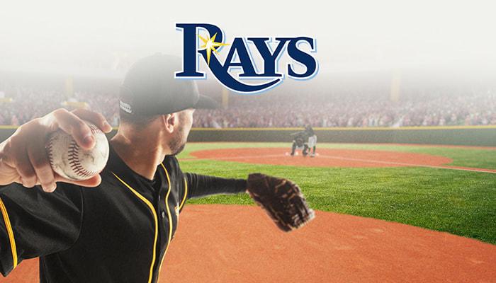
Best Sports Rebrands: Tampa Bay Rays
The Tampa Bay Rays baseball team was founded and established in 1998. The team debuted as the Tampa Bay Devil Rays. The logo consisted of the word “Devil Rays” along with an image of a stingray.
From 1998 to 2008, the team never finished with a record of .500 or better. Their best record was 70-91 in 2004, featuring players such as Carl Crawford, Tino Martinez, Aubrey Huff, Rocco Baldelli, Julio Lugo, and others.
However, ahead of the 2008 season, the team did a complete rebrand. The hats were now completely blue with a white “TB” logo. The official logo of the team had “Rays” with a baseball diamond behind it.
This was just in time for Joe Maddon’s third season as the manager, the owner, Stu Sternberg to raise the payroll to $43 million, and had talents liek James Shields, Matt Garza, David Price, Ben Zobrist, and a third baseman prospect that would go on to the be the best Rays player ever, Evan Longoria.
In their first season as the Rays following the rebrand, they went 97-65 and advanced to the World Series. On the way there, they took down the Boston Red Sox, who had won the World Series just a year before.
Since the 2008 rebrand, the team has finished under .500 just four times, and two of those seasons were 80-82 records. Needless to say, this was one of the stronger sports rebrands.
The franchise completely turned around thanks to its talent depth, and the rebrand certainly got fans excited about what was to come in the future, making it one of the best sports rebrands in recent memory.
Worst Sports Rebrands: Washington Commanders
Until 2019, the Washington team was referred to as the “Redskins,” a name they had used since 1937.
On July 3, 2020, the team opted to retire the name after backlash from some who considered it a slur, and prominent sponsors threatened to pull out.
We’re not here to argue about whether the name should’ve changed or remained the same, but it was what came after that felt lackluster, to say the least.
Of course, whenever you’re replacing a name that spans generations for a reason that some may not view as worthwhile, it’s going to draw criticism and be considered by many to be one of the worst sports rebrands.
However, in the aftermath, the team went by the name “Washington Football Team” for two seasons.
In 2022, the team finally adopted the name “Commanders.”
This came after what was referred to as an “exhaustive but overly secretive” process, which involved feedback from fans, players, and designers.
After receiving 40,000 fan responses, the decision felt somewhat disconnected, as the name was considered bland and uninspiring.
Some fans, according to Sports Business Journal, called it “deeply boring,” “corny,” and a “predictable outcome from a risk-averse team.”
In fact, some believed that sticking with the Washington Football Team would’ve been better, as it was relatively unique.
Additionally, given the length of the process, the result didn’t feel like it matched the anticipated hype surrounding the renaming.
Overall, this was a rebrand that was set up to be disliked or lukewarm by many in the short term, but will likely be OK in the future.
Still, it’s one of the worst sports rebrands in recent memory for multiple reasons, as mentioned above.
Best Sports Rebrands: Chicago White Sox
Not only was the White Sox sports branding impressive in terms of the uniform’s overall look, but it also made a significant fashion statement at the time, particularly in the hip-hop scene.
MLB.com called the rebranding “a masterclass in reinventing yourself.”
The sleek black and white palette was much better than the former “hit man” logo and red-and-blue schemes. This reinvigorated fan pride.
Additionally, as seen in the “Fitted in Black” documentary, this was a massive fashion statement.
“The hit man logo was probably the first instance of me loving the White Sox logos,” said Carrico “Kingdom Rock” Sanders, a lifelong White Sox fan. He was also one of the founders of the Chicago Hip Hop Heritage Museum.
“Then the rebranding came, and the way hip-hop adopted the White Sox logo, it was like a symbol of pride to all of us.”
“I think one of the things that’s really underrated about the cap is the clean design,” said Shakeia Taylor, a sportswriter with the Chicago Tribune. “It’s very clean. It’s super straightforward, it’s black, the letters are white. … And Olde English letters in the ’90s were really popular.
“People were getting Olde English tattoos. You had the nameplate jewelry where you could get your name in Olde English letters. I think that played a part.”
The hat was also worn by Ice Cube, a massive hip-hop artist who some say popularized the black and white hat as a fashion statement.
This was one of those sports rebrands that transcended sports.
Worst Sports Rebrands: Cleveland Browns
The Browns unveiled new designs in 2015, following a significant amount of hype regarding the upcoming changes. Well, after they were revealed, it fell flat. Sure, it made sense to tidy up the logos and brand, but it involved a sharper orange helm and a new dog logo. That was it. There wasn’t really much else to it.
Needless to say, it was a safe change that left fans wondering why there was so much hype for something that probably could’ve just been done without anyone really paying much attention to it.
One of the worst sports rebrands simply due to how unnecessary the hype was.
Best Sports Rebrands: Charlotte Hornets
While you peruse NBA sportsbooks today, you’ll find that you’re able to bet on the Charlotte Hornets, but in the not-so-recent past, the team was referred to as the Charlotte Bobcats.
From 1988 to 2002, the team was known as the Hornets. However, after 2002, the team relocated to New Orleans and was then known as the New Orleans Hornets before eventually becoming the New Orleans Pelicans.
However, with that team relocating to New Orleans, a deal was in place to bring a replacement team to Charlotte, and that team became the Bobcats.
In 2014, Michael Jordan, who had acquired the team a few years earlier, was officially able to change the team’s name back to the Hornets. This already made it one of the best sports rebrands.
It was announced on November 22, 2024, and the team adopted a modified version of the original Hornets color scheme, which featured a teal-purple-white palette, a design adored by fans and viewed as a fashion statement and further reiterating that branding in sports matters.